BACKGROUND

UX PORTFOLIO DESIGN

UX+UI/ Information Architecture/ Interaction Design

UX+UI/ Information Architecture/ Interaction Design

UX+UI/ Information Architecture/ Interaction Design

As a UX designer breaking into the field, I set out to build a portfolio that not only showcases my skills but also reflects my design process and problem-solving approach.


While researching what makes a compelling UX portfolio, I found that many lacked depth in usability testing and user research—two areas I wanted to highlight.

The goal was to create a portfolio that is both visually engaging and strategically structured, demonstrating my ability to craft intuitive user experiences while applying industry best practices. At the same time, I wanted it to reflect my personality, ensuring it feels authentic and distinct in a competitive field. This case study documents my approach, challenges, and insights gained along the way

Date


Date


Date


March- April 2025

March- April 2025

Role


Role


Role


UX+ UI Designer

UX+ UI Designer

UX+ UI Designer

Deliverables


Deliverables


Deliverables


Build and maintain a responsive UX Design Portfolio

Build and maintain a responsive UX Design Portfolio

Build and maintain a responsive UX Design Portfolio

User Research

To ensure my portfolio effectively meets industry expectations, I started by researching what UX recruiters and hiring managers look for in junior design portfolios. I conducted an affinity mapping exercise to identify common usability issues they face during the hiring process. Understanding these pain points helps inform my design decisions, ensuring I avoid common mistakes and incorporate elements that enhance clarity, usability, and engagement in my own UX portfolio.

I opted for affinity mapping over empathy mapping since ample insights from recruiters and hiring managers are readily available online. Instead of conducting in-person interviews, synthesizing this existing data into an affinity diagram allowed me to efficiently identify key insights and common patterns, making better use of my time

Defining the Problem

Problem statement:


Time-pressed recruiters and hiring managers often find it challenging to evaluate a candidate’s UX skills and design process due to portfolios that lack clear communication, usability, and an engaging narrative. This results in frustration and overlooked talent, as the rushed review process struggles to uncover a designer’s true capabilities when portfolios are cluttered, difficult to navigate, or fail to tell a compelling story that highlights both skills and the thoughtful process behind the work.


HMW statement:

How might I design a UX portfolio that clearly communicates my skills and design process to time-pressed recruiters while maintaining clarity, usability, and an engaging narrative ?

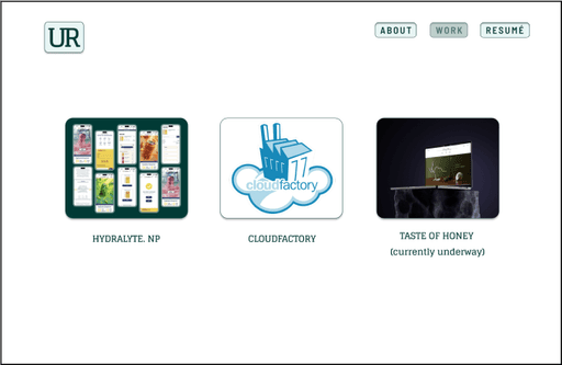
Wireframes and Prototype

Now that I had a clear understanding of what makes a strong portfolio, I wanted to see how other designers put these elements into practice. I conducted a competitor audit, taking note of what stood out to me and sketching wireframes to capture effective layouts and design patterns.

From there, I started creating prototypes, ensuring that every design decision was informed by my research and aligned with best practices. Interact with the first prototype here.

Usability Testing

To evaluate the effectiveness of my portfolio’s first prototype, I conducted a usability test to gather feedback on clarity, scannability, narrative engagement, and overall user experience. Since I didn’t have direct access to UX recruiters or hiring managers, I recruited participants from my network—primarily family and friends working in design-adjacent fields. While their feedback required some contextual consideration, their insights were still valuable in identifying areas for improvement.


I conducted moderated usability tests, combining structured feedback collection via Google Forms with in-person conversations to capture qualitative insights. Key findings were documented, and required changes were systematically tracked in Google Sheets, ensuring an organized approach to iteration.

Final Design Decisions

The final design reflects a series of aesthetic refinements informed by insights gathered during usability testing. While the core structure and navigation of the site remained intact, changes were primarily focused on typography, color, and visual interactions. I aimed to introduce bold, punchy elements to counteract visual monotony and bring more energy into the user experience.

To make the site feel more personal and reflective of my voice as a designer, I integrated hand-drawn doodles throughout the interface—subtle moments of personality that balance the structured layout. I also prioritized responsiveness using a graceful degradation approach, ensuring the site performs well on smaller screens while optimizing the experience for desktop, where most users are likely to engage with the portfolio.

To evaluate the effectiveness of my portfolio’s first prototype, I conducted a usability test to gather feedback on clarity, scannability, narrative engagement, and overall user experience. Since I didn’t have direct access to UX recruiters or hiring managers, I recruited participants from my network—primarily family and friends working in design-adjacent fields. While their feedback required some contextual consideration, their insights were still valuable in identifying areas for improvement.


I conducted moderated usability tests, combining structured feedback collection via Google Forms with in-person conversations to capture qualitative insights. Key findings were documented, and required changes were systematically tracked in Google Sheets, ensuring an organized approach to iteration.

Key Takeaways

One thing that became clear between my first and second iterations was how much I was trying to balance showcasing what I thought recruiters and hiring managers were looking for with expressing my own personality and design voice. Most of the changes I ended up making were aesthetic—small shifts that helped the site feel more like me.

Through this process, I’ve learned not to obsess over every tiny decision. Iteration is where clarity and direction really take shape. Each round brought me closer to a portfolio that feels both intentional and well-considered.

To evaluate the effectiveness of my portfolio’s first prototype, I conducted a usability test to gather feedback on clarity, scannability, narrative engagement, and overall user experience. Since I didn’t have direct access to UX recruiters or hiring managers, I recruited participants from my network—primarily family and friends working in design-adjacent fields. While their feedback required some contextual consideration, their insights were still valuable in identifying areas for improvement.


I conducted moderated usability tests, combining structured feedback collection via Google Forms with in-person conversations to capture qualitative insights. Key findings were documented, and required changes were systematically tracked in Google Sheets, ensuring an organized approach to iteration.